You have put all your efforts into attracting potential customers. You have spent a lot of time and money on developing your eCommerce business to give an effortless approach, flawless product page, and provided a path that directs your visitors to the checkout page.
Checkout is the last step of every purchase but a poor checkout experience can drive visitors away. It is the process including multiple steps which is to be filled by the customer for making a successful purchase. Talking about eCommerce, checkout is the winning goal of a football match. Many of our eCommerce store owners are distressed with the bounce rate and facing abandoned cart at the checkout page. Stop worrying.
In this article, you will find out the ways for optimizing your checkout page. First of all, I will suggest you replace your multi-step checkout with a One Page Checkout module.
One Page Checkout module is available for PrestaShop, OpenCart, Magento, and Magento 2 platforms.
Check out the modules from below links:
1. Optimize for mobile-friendly first-
Be it an elder or millennials, most of the people prefer shopping from their mobile phones. Optimize your checkout page and make it mobile responsive.
2. Allow guest checkout-
Mandatory registration not gonna work. Don’t be pushy instead asking your visitors to make guest checkout will increase conversions on your eCommerce store. One Page Checkout addon offers Guest Checkout functionality.
3. Don’t ask for unnecessary information-
The One Page checkout extension with optional fields in a registration form is a win-win. Avoid unnecessary fields from the form or make them optional.
4. Use clean design and keep it simple-
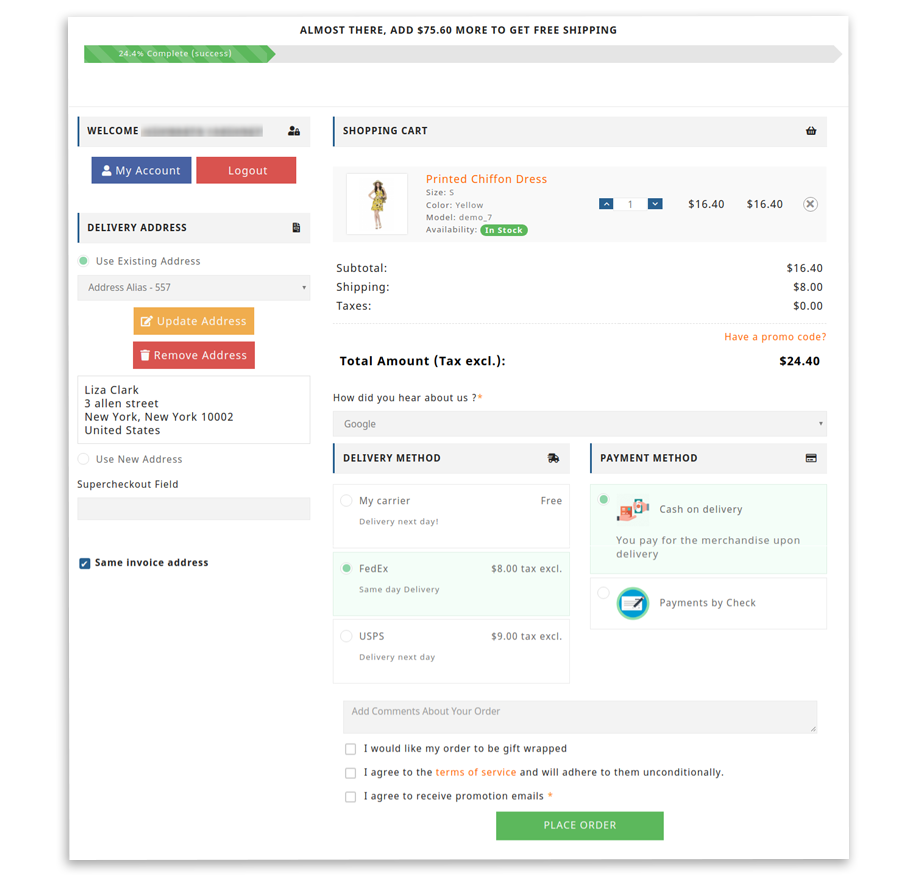
A sleek and simple UI will attract more buyers. If you have already decided to replace the conventional checkout page then One Page Checkout module will be the best choice available as it has a clean and simple design which makes it attractive.
5. Display Cart Content with ample product details-
When we do in-store shopping, the purchased products are always in front of our eyes in our shopping cart. You can provide a similar experience to your online shoppers by enlisting necessary product details on the checkout page.

6. Offer multiple payment gateways and shipping choices-
Not every customer relies on the same payment methods and providing limited options will drive your customers away at the last stage of the purchase. Try including multiple payment options in your checkout page.
One Page Checkout module offers various shipping options to the customers. Store owner can add numerous shipping processes for different payment modes.
7. Show Progress-
Use a progress bar, progress meter design feature, or other methods to show shoppers the steps they need to take to complete the checkout process. Progress bar will make them aware of where they are at every step along the way in that process.
8. Feature security seals as trust signals-
Most of the shoppers feel suspicious or are concerned about the payment. Try adding security badges as trust signals on the relevant page. This will improve the retention rate.
9. Remind visitors constantly of your importance-
Highlight benefits such as free delivery, quick and easy returns and security signals while shopping.
With One Page checkout addon, you can provide a separate bar on the top of the page which shows free shipping message with the eligible amount.
10. Use form validation and error notifications
You can give an inline validation error message if the customer fails to fill the relevant information in the mandatory tab. An error alert will be displayed instantly below the field button.
11. Speed up registration with Social Login-
A long, boring registration form forces customers to leave the checkout page. You can offer them the quickest way for registration-Social Login. One Page Checkout module allows user to register with their existing social media account by entering an email address.
The social login feature is a beneficial one as it collects authentic data and you get more relevant information about the customer like birthdate, interests, etc.
12. Auto-save cart contents when abandoned-
It is good practice to provide if the cart content will be auto-saved in case the customer changes his mind on the last minute of purchase. Customers can come back to the website and complete the process later. You can send a follow-up mail if you want to. Optimize the checkout page to take the advantage of auto-save cart contents when abandoned features.
13. Use discount and promo codes carefully-
Give a call to action button for applying discount coupons and codes. Do not offer one when the customer is on the last stage of checkout. Provide a separate field for applying coupon code. You can add custom field in your registration form with One Page Checkout addon.
14. Remove surprise costs and fees-
If you are charging delivery fees then make sure to inform your customer beforehand. Last-minute changes will make them insecure and they will leave the process right away.
15. Send post-payment order confirmation-
Do not forget to inform your customers about their successful payment. This mail will help them recheck the order and they will feel confident while shopping with you next time.
16. Follow-up-
Since you have already collected their email then make some good use of it by dropping a follow-up mail. You can ask for reviews and feedback. This is a good way of improving customer engagement.
Wrap-Up
Optimizing the checkout page is an essential part of the website if you own an eCommerce store. One Page Checkout provides you with all the above-mentioned features which will make the checkout experience smooth and superior. Customer satisfaction and comfort is the main goal of the One Page Checkout Module. It makes the registration and checkout process simple and effortless. If you are looking for a solution to optimize your checkout process then you can give it a try.


